12 min readAlex Andrade
Auditing our design system MCP
Our design system MCP server seemed to work. Then I let a blind agent build from it and found out what it was actually handing agents.
- #design-systems
- #ai
- #mcp
Our design system docs were written for humans. Then we served the same docs to AI agents through an MCP server. What we didn’t know: those docs had blind spots, and the agents never told us. They just guessed.
A month ago I wrote about teaching AI to use your design system: how we gave agents access to Sous Chef, the 7shifts design system, through our own MCP server. We tested it by hand, and it seemed to work. Done, right?
Not quite. When an agent doesn’t understand your docs, it doesn’t complain. It guesses. Sometimes the result still works, but the agent had to think more, spend more tokens and go looking for the information some other way. And sometimes it doesn’t work at all.
Docs for humans vs docs for agents
Before you read the examples below and think “wow, that design system was a mess”, let me be clear: it wasn’t. These docs were fine for the people they were written for.
When you document for humans, a snippet doesn’t need to be perfect. You show the important part, skip the boilerplate and trust the reader to fill in the rest. A missing import or a hidden prop is no big deal, because a human knows the codebase and figures it out.
An agent can’t do that. It needs code that compiles, props that actually exist and nothing left to guess. Every gap becomes a guess, and every guess can drift away from what the docs meant.
So the question isn’t “were our docs good?”. It’s “were they good for an agent?”. I had never checked. When I finally did, I found 38 problems.
This post is about what was wrong, what we didn’t know was wrong, and, most of all, how I found it.
How I audited
Here is the setup. I asked Claude to act as a product engineer with no repo access. It got the six Sous Chef MCP tools and nothing else. No source code, no Storybook website, no tribal knowledge. Just the answers.
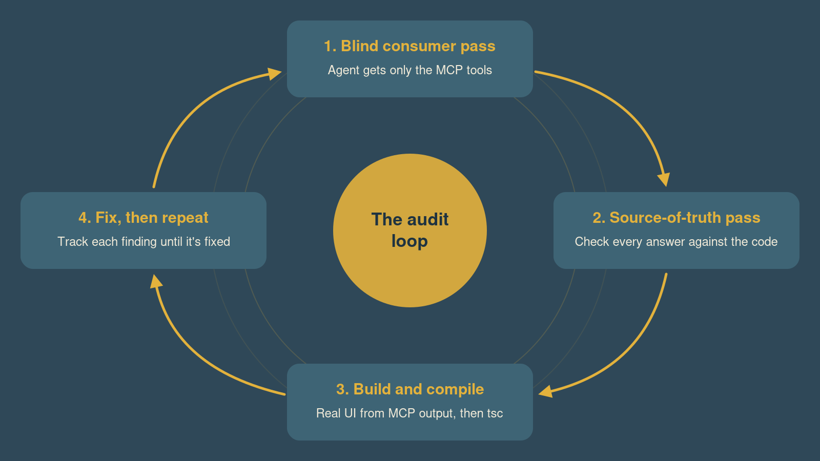
Then I ran three passes.
1. The blind consumer pass
The agent browses the reference, fetches components and tries the kind of things a real agent does: lowercase names, typos, sub-components, icons, wrong story names. Then it builds real UI from the answers.
This is the important part. A human who knows Sous Chef reads a broken doc and fills in the gaps without noticing. A blind agent can’t. It does exactly what the docs say, which makes it the perfect test user for docs whose readers are agents.
2. The source-of-truth pass
A second pass checks every answer against the source: the LLM instructions, the Storybook manifest, and the component, story and MDX files. Anything marked “verified” was confirmed by hand.
The first pass tells you what the agent believes. The second tells you whether that belief is true.
3. Build and compile
Reading docs finds contradictions. Building from them finds missing information. So I also had the agent build things using only MCP output: a Formik + Yup form inside a Modal, and a full page with a DataTable, a Dropdown, a confirm Modal, a toast and Tabs. Then I ran tsc on the result. Any claim about runtime behaviour was reproduced in Jest.
Then repeat
After every batch of fixes I ran the exact same method again and tracked each earlier finding as fixed, partly fixed or still open. This turned out to matter a lot, because fixes introduce their own bugs (more on that in the lessons).
What was wrong
Let’s take a look at some of the cases. I picked four. Every “before” below is real output the agent received, not something I rewrote by hand.
The props table that couldn’t be read
The ask: get_component_details("Button"). Before:
| Prop | Type | Required | Default | Description |
|------|------|----------|---------|-------------|
| `type` | `"button"` | `"submit"` | `"reset"` | No | `'button' as const` | Native HTML button type. … |
| `theme` | `"default"` | `"primary"` | `"danger"` | `"upsell"` | … | `"link-icon"` | No | `'default' as const` | Button design theme |
| `href` | `string` | No | — | @description It will show a black tooltip when the user hover the button.
@category Acting as Link |
See the problem? The | in "button" | "submit" is read as a column separator. On theme, the 13 options spread across 13 columns, so “Required”, “Default” and “Description” land in the wrong places. That happened on almost every component: 236 broken rows.
And that’s just the first problem in one response. There was also no description of what a Button is, no children prop (it had no JSDoc comment, so it was invisible), an href description copied from title, raw @description and @category tags leaking out, defaults shown as source code ('button' as const), and ten margin rows on every component.
After:
# Button
Buttons trigger actions or navigation. … Use the `theme` prop for primary, danger, upsell and link styles, and `href` to make it act as a link.

| `children` | `ReactNode` | Yes | — | Content of the button. Usually a text label; … |
| `type` | `"button"` \| `"submit"` \| `"reset"` | No | `"button"` | Native HTML button type. … |
| `href` | `string` | No | — | URL to navigate to. When provided, the button renders as an `<a>` element … |

**Positioning props** (optional, `string | number`): `m`, `margin`, `mt`, `marginTop`, …
The main fix was a single regex that escapes the pipes:
function escapeTableCell(text: string): string {
    return text.replace(/(?<!\\)\|/g, '\\|');
}
The rest was a JSDoc pass across the library and a docgen cleanup step in Storybook. A markdown table looks fine in a code review and is garbage to a model.
Stories that hid the important part
The ask: get_component_details("Modal"), first story. Before:
import {
    Button,
    EmptyState,
    Form,
    // …13 more
} from "@7shifts/sous-chef";

const Default = (args: React.ComponentProps<typeof Modal>) => {
    const [isOpen, setIsOpen] = useState(false);
    return (
        <>
            <Button onClick={() => setIsOpen(true)}>Show modal</Button>
            {isOpen && (
                <Modal {...args} onClose={() => setIsOpen(false)}>
header, the prop every modal needs, is hidden inside {...args}. No Modal example anywhere showed how to title a modal. The import lists 16 symbols when the snippet uses 4, and useState is never imported.
After:
import { Button, Modal, ModalBody, ModalFooter } from "@7shifts/sous-chef";
import { useState } from "react";

const Default = () => {
    const [isOpen, setIsOpen] = useState(false);
    return (
        <>
            <Button onClick={() => setIsOpen(true)}>Show modal</Button>
            {isOpen && (
                <Modal
                    header="Confirm shift assignment to employee"
                    subHeader="Alex Andrade"
                    onClose={() => setIsOpen(false)}
                >
To be fair to Storybook, {...args} and shared templates are good practice there. They are built for humans clicking Controls. But once your stories double as documentation for an agent, each one has to stand on its own.
A guideline for props that don’t exist
The Badge guidelines, served right inside get_component_details("Badge"):
Badge supports 5 themes that change its background colour: `default`, `success`, `danger`, `warning`, and `info`.

Badge supports two sizes via the `size` property: `default` and `dot`.
There is no size prop, no dot variant and no default theme. The props table and the guideline sat in the same response and contradicted each other. The agent had no way to know which one to trust.
After:
The `theme` prop accepts 4 values …: `success`, `danger`, `warning`, and `info`. Leave `theme` unset for the default neutral colour.

Badge has a single size and no `size` prop. It grows to fit its content, so keep the content short.
Badge wasn’t alone. Avatar, Toast and Dropdown had the same kind of drift, and some guidelines even named components that don’t exist, like ButtonGroup and Select. Guidelines are written in a different place, by different people, on a different schedule than the code. With a human reader, drift is an annoyance. A model reads it as an API spec.
“Not found” for the parts you actually need
Imagine an agent building a confirm dialog. It needs the footer, a toast and an icon. Before:
get_component_details("ModalFooter")
→ No Sous Chef component named "ModalFooter" was found in the manifest. Did you mean one of: modal?

get_component_details("Toast")
→ No Sous Chef component named "toast" was found in the manifest. Did you mean one of: toastcontainer?

get_component_details("IconPencil")
→ No Sous Chef component named "IconPencil" was found in the manifest.
Sub-components like ModalFooter, Tab or RadioGroupOption are where the props for footers, selectable rows and editable cells live, and none of them could be fetched. The toast() function signature appeared nowhere. Nothing said that SousChefProvider already mounts a ToastContainer, so agents that copied the stories rendered a second one.
After, Toast has its own entry:
# Toast
… There is no `<Toast>` component: call the `toast(text, theme?, options?)` function instead.

```tsx
toast('Changes saved');
toast('Could not save changes', 'danger');
```

`SousChefProvider` already mounts a `ToastContainer`, so don't render one yourself.
And so does every one of the 890 icons and illustrations, including accessibility guidance (aria-hidden next to text, role="img" and an aria-label when an icon stands alone).
The root cause: the server indexed what Storybook indexed, one entry per stories file. Your users don’t think in stories files. They think in the names they import.
What’s different now
The first big change is coverage. Lookups went from about 66 entries to 984. Every icon, illustration and sub-component can now be looked up by the name you import. Typos get real suggestions too: "Buton" now suggests Button, instead of just “not found”.
The second change is that the examples work. The latest round compiled every code block in every reference: 32 of 35 passed, and the 3 failures are intentional fragments. The agents built three apps from MCP output only, and they type-checked.
But the most interesting change was something I didn’t expect.
Once the docs described the behaviour precisely, the audit could test those claims, and some turned out to be false because the code was broken. Let’s take a look at one. Before:
export const getFormikArrayPath = (name: string): string[] =>
    name.split(/[^a-zA-Z0-9]/).filter(Boolean);
name="first_name" became the path ['first', 'name']. The field read values.first.name, while writes went to values.first_name. No value, no error, no warning. Just a field that silently didn’t bind. After:
// Uses the same parser as Formik's `getIn`/`setIn`, so only `.`, `[` and `]`
// are path separators and names like `first_name` stay a single key.
export const getFormikArrayPath = (name: string): string[] => toPath(name);
It wasn’t the only one. <Form onSubmit formik> skipped Formik validation when you passed both props. Numeric RadioGroupField values never showed as checked. In the latest round, 4 of the 5 new high-severity issues were component bugs, not doc bugs:
PillSelectField’s “Add your own” button has notype, so it submits the surrounding form.TimeRangeFieldnever marks itself touched, so its errors never show.DateFieldandWeekFielddon’t show a value that arrives after mount, so editing a saved record shows blank dates.ActionListItemnests buttons, so clicking a row action also fires the row’sonAction.
These bugs were always there. Humans worked around them by trial and error. An agent following the docs exactly hits them every time. That’s actually progress: the MCP is now good enough to act as a test harness for the library itself 👌
Lessons
- Audit the output, not the source: the broken props table was invisible in the
.tsxfiles and obvious in the tool response. - Use a blind agent as the test user: it doesn’t know the workarounds, so it does exactly what the docs say.
- Make the auditor build and compile: reading finds contradictions. Building finds what is missing.
- Your docs are only as good as your weakest source: props come from JSDoc, examples from stories, guidance from MDX, reference text from generators. Each one had its own failure mode.
- Stories are API documentation now: each story has to be a complete, copyable example.
- Index by the names people import: not by stories files.
- Delivery is part of the product: a fix that is merged but not served is not a fix. Check that the agent actually sees it.
- Re-audit after every batch of fixes: our fixes introduced regressions, like a snippet serializer that dropped JSX spaces (
"$6.99per month") and duplicate import lines.
Let’s wrap it up
So what does all this mean?
In the first post I said a design system has to expose judgment. The audit showed the other half: what it exposes also has to be true. A model copies your examples exactly, typos and all. If you wouldn’t merge it as code, don’t ship it as documentation.
To be honest, we are not done. The component bugs above are still open, along with types the docs present as importable but that aren’t exported, and some guideline and JSDoc corrections. The compile check isn’t in CI yet.
But now I know where the problems are, and I have a method to find the next ones. Give your MCP server to a blind agent and see what it builds. You might be surprised 😅
Enjoyed this? Get the next one by email
A monthly email on design systems, AI and frontend: new posts and what I am learning building Sous Chef. No spam, unsubscribe anytime.